10 Meaningful Easter Color Palettes That Feel Intentional & Fresh
Disclosure: This post may contain affiliate links and advertisements. I may earn a commission at no additional cost to you. Content is supported with Ai and is for entertainment purposes only.
Easter is one of those holidays where color quietly carries the whole tone.
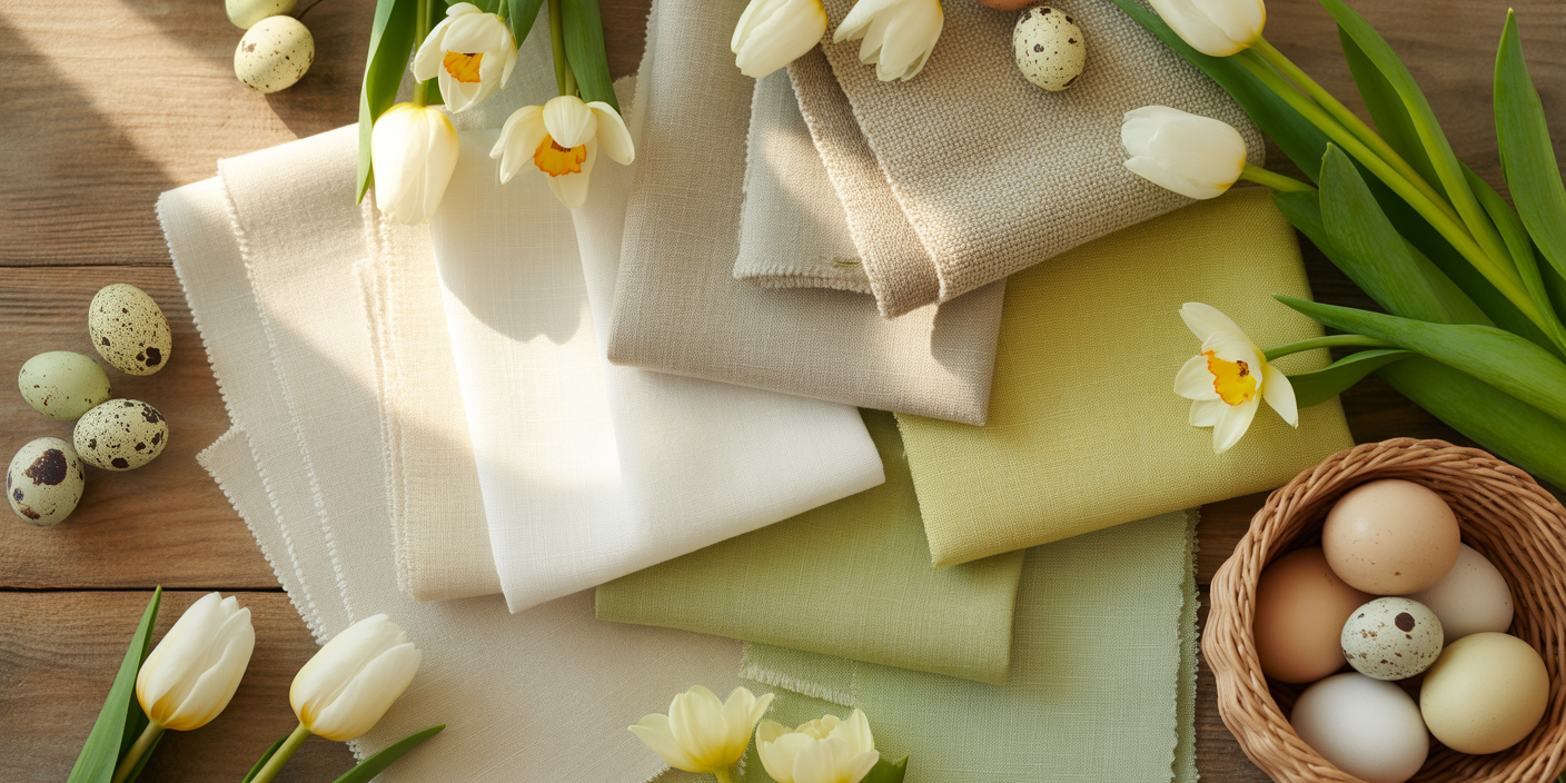
I always notice how the right palette can make a simple table feel thoughtful, warm, and completely put together without needing dozens of decorations. When I’m planning Easter decor or a spring brunch, I usually start with color first. It sets the tone before flowers, before food, before anything else.
I personally love Easter palettes that feel meaningful, not just pretty. Soft pastels can represent renewal. Gentle greens feel hopeful. Creamy neutrals bring peace. A meaningful Easter color palette helps your tablescape feel intentional rather than random.
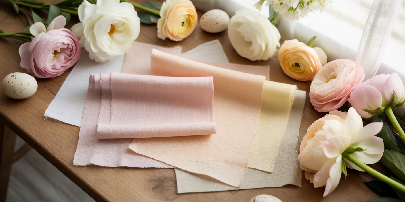
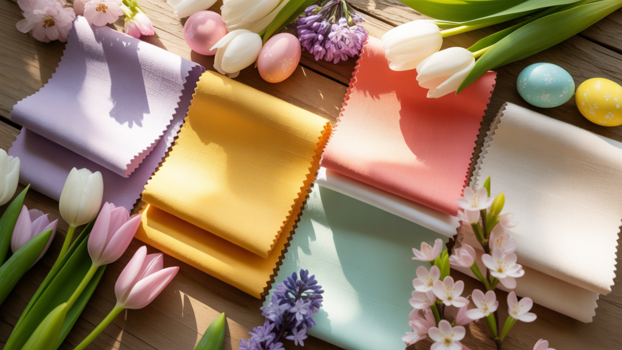
1. Blush & Buttercream 🌸
Meaning
Blush represents gentleness and affection, while buttercream feels warm and comforting. Together, they create a soft, welcoming Easter palette.
Decor That Pairs Well
Linen napkins in blush tones, cream ceramic plates, gold flatware, and delicate florals like ranunculus or tulips.
What to Avoid
Avoid pairing this with harsh bright reds or neon pinks. It can overpower the softness.
Tablescape Idea
Layer a buttercream tablecloth with blush napkins tied in thin gold ribbon. Add a small white egg at each setting with a handwritten name.
Food Pairings
Strawberry shortcake, vanilla cupcakes, raspberry lemonade, and light tea sandwiches.
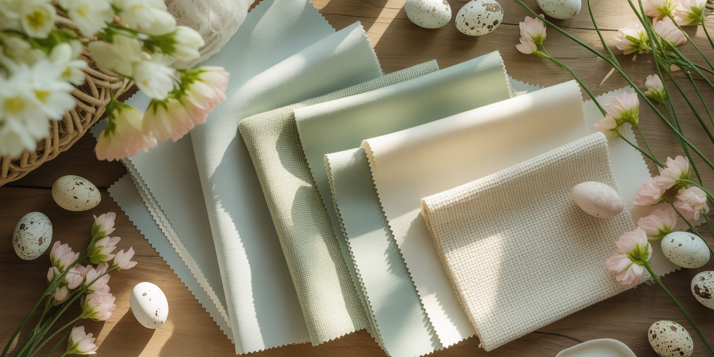
2. Sage & Ivory 🌿
Meaning
Sage symbolizes renewal and growth. Ivory represents calm and simplicity. This palette feels grounded and peaceful.
Decor That Pairs Well
Woven placemats, ivory candles, soft greenery garlands, and wooden serving boards.
What to Avoid
Avoid overly shiny metallic decor. This palette thrives on natural textures.
Tablescape Idea
Use an ivory tablecloth, layer sage napkins, and run a loose greenery garland down the center.
Food Pairings
Herb roasted potatoes, lemon chicken, cucumber salad, and sparkling water with mint.
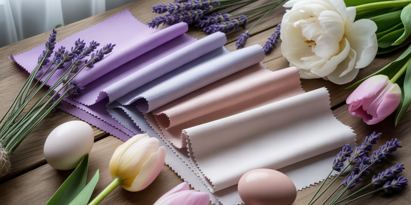
3. Lavender & Soft Gray 💜
Meaning
Lavender symbolizes grace and spring renewal. Gray softens it and adds sophistication.
Decor That Pairs Well
Matte ceramic plates, lavender taper candles, silver accents, and fresh lilacs.
What to Avoid
Avoid pairing with bright yellow, which can clash visually.
Tablescape Idea
Use a soft gray runner over white linen and place lavender napkins folded loosely.
Food Pairings
Blueberry tarts, lavender cookies, cream cheese pastries, and grape spritzers.
🐣 Quick & CUTE Additional Easter Decor to Consider: 🐣
- Cute Carrot Garland
- Easter Toned Ballon Kits
- Pastel Toned Table Runners
- Egg and Flower Greenery Garland for Table
- Gold Bunny Table Top Decor
- Gorgeous Easter Wreaths
- Soft Pastel Speckled Eggs
- Bunny Pillows
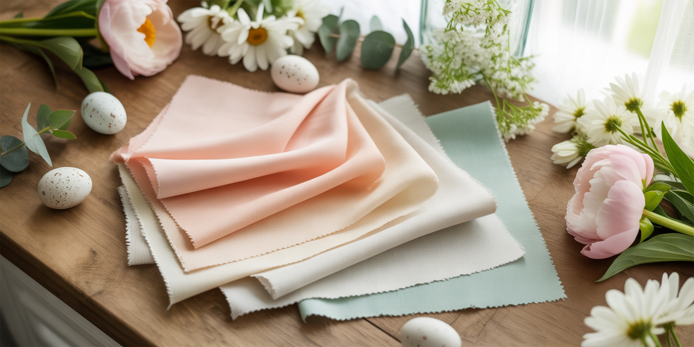
4. Peach & Mint 🍑
Meaning
Peach represents warmth and joy. Mint symbolizes freshness and new beginnings.
Decor That Pairs Well
Clear glassware, pastel candles, and subtle gold details.
What to Avoid
Avoid mixing in too many pastel shades. Keep it focused to maintain harmony.
Tablescape Idea
Alternate mint and peach napkins at each setting for a playful but cohesive look.
Food Pairings
Fruit salad, carrot cake, mint lemonade, and peach cobbler bites.

5. Sky Blue & White ☁️
Meaning
Sky blue evokes hope and open skies. White symbolizes renewal and purity.
Decor That Pairs Well
White floral centerpieces, light blue glassware, and delicate lace runners.
What to Avoid
Avoid dark navy accents, which may make it feel heavy.
Tablescape Idea
Use white dishes with soft blue napkins tucked beneath each plate.
Food Pairings
Coconut cupcakes, lemon bars, blueberry muffins, and iced tea.
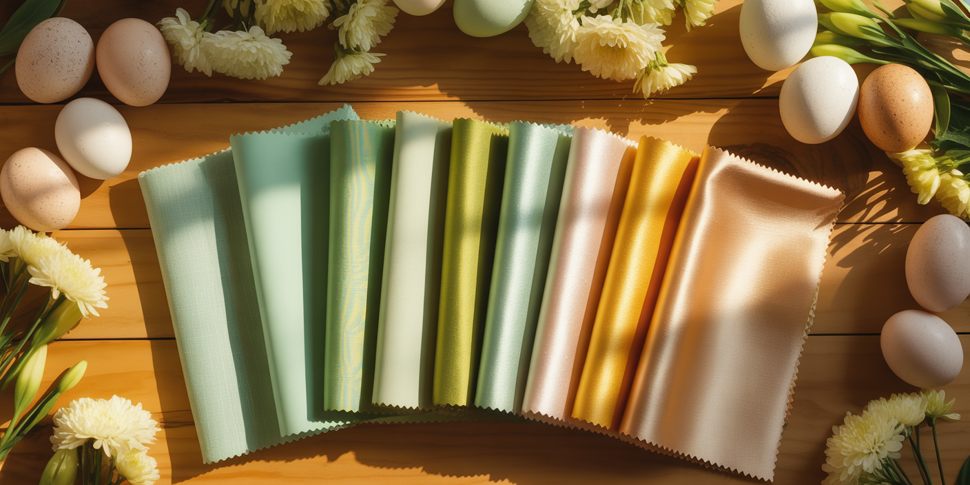
6. Pistachio & Gold ✨
Meaning
Pistachio green feels fresh and optimistic. Gold adds celebration and warmth.
Decor That Pairs Well
Gold-rimmed plates, pale green napkins, and white florals.
What to Avoid
Avoid mixing in silver metallics. Stick to one metal tone.
Tablescape Idea
Scatter gold votives among pistachio linen accents for subtle glow.
Food Pairings
Macarons, sugar cookies with gold drizzle, sparkling cider.
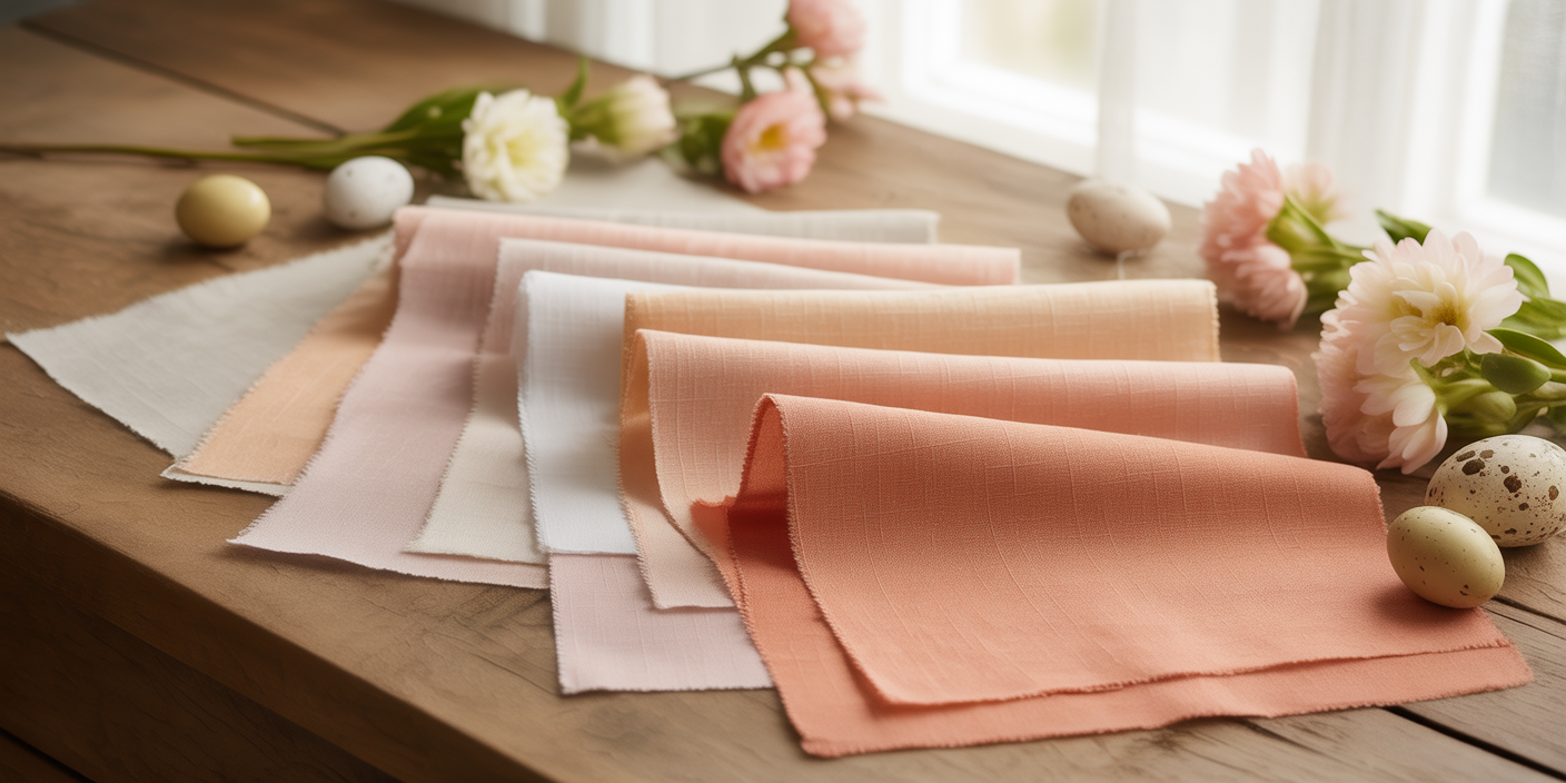
7. Coral & Cream 🌺
Meaning
Coral radiates energy and happiness. Cream softens and balances it.
Decor That Pairs Well
Neutral linens, floral centerpieces, and light wood accents.
What to Avoid
Avoid adding too many bright oranges. Keep coral as the main bold color.
Tablescape Idea
Use cream chargers and coral napkins folded in soft layers.
Food Pairings
Deviled eggs, fruit tartlets, coral-colored mocktails.

8. Dusty Rose & Olive 🌹
Meaning
Dusty rose reflects romance and reflection. Olive green symbolizes peace.
Decor That Pairs Well
Ceramic plates, tapered candles, natural greenery.
What to Avoid
Avoid pairing with neon tones.
Tablescape Idea
Layer olive runners under dusty rose floral arrangements.
Food Pairings
Rosewater cupcakes, herb focaccia, berry salads.
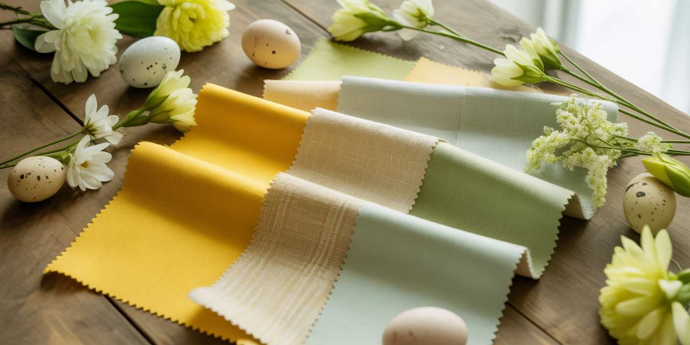
9. Lemon & Sage 🍋
Meaning
Lemon yellow symbolizes joy. Sage represents renewal.
Decor That Pairs Well
White ceramics, woven textures, fresh lemons as decor.
What to Avoid
Avoid bright neon yellow.
Tablescape Idea
Place sliced lemons in clear bowls down the center of the table.
Food Pairings
Lemon cake, citrus salad, sparkling lemonade.
10. Neutral Linen & Soft Green 🤍
Meaning
Neutral linen tones represent simplicity. Soft green speaks to life and growth.
Decor That Pairs Well
Natural wood, ceramic dishes, linen napkins.
What to Avoid
Avoid heavy metallics.
Tablescape Idea
Keep everything light and layered with texture rather than bold color.
Food Pairings
Fresh bread, butter, simple pastries, herbal tea.
Common Easter Color Palette Mistakes
• Mixing too many pastel shades at once
• Overloading with metallic decor
• Forgetting texture
• Using clashing greens
• Ignoring lighting (warm lighting enhances pastel palettes beautifully)
Keeping your palette focused to two or three main colors keeps everything balanced.
Why Meaningful Easter Palettes Matter
Easter color palettes shape the feeling of your celebration. They guide decor choices, influence food styling, and bring cohesion to your table. When colors are chosen intentionally, even simple decorations feel elevated.
Whether you lean toward blush and buttercream or sage and ivory, each palette tells a story. Easter is a celebration of renewal, hope, and joy. Choosing colors that reflect that meaning makes the day feel even more special.
A beautiful Easter table doesn’t need to be complicated. It needs intention.
Wishing you the best in your beautiful life!✨
Warmly,
Jenna
Get Profitable Online!
Clearly Entrepreneurially Elevated
Learn how to become profitable through blogs with affiliate links, videos with ads, memberships, coaching, and events.
All women deserve higher levels of love, health, wealth, and abundance. Follow your passions.
Freebies are Fun!
Join our amazing newsletter with fun tips, & receive the following feel good freebies:
- Opt In For Today's Freebie: "The #1 Reason Why People Purchase"
The number one reason people buy isn’t typically logic— This freebie reveals how to communicate your offers in a way that helps connect the dots. Move authentically towards more sales! Fulfill your mission.